Mathematics on the Web
This page recreates a few of the links found on the more comprehensive page
http://www.cecm.sfu.ca/~jalester/MOTWsites.html.
That page includes links used in a talk by June Lester about what does
and does not work when attempting to communicate mathematics on the web.
On this page we illustrate some of what doesn't work.
Note: our focus here is on the presentation of the
web pages, rather than the creation of them. There are many products
which, for example, will create in-line GIFs to display formulae; some
may create these GIFs with much less effort on the part of the page
designer, but that's not what we wish to critique here. Our criteria only
concern the final product -- how will your web page look on my screen?
More precisely, I show here the effect of visiting some of the sample pages
which were evidently intended by the designers of these products
to illustrate how well (or how easily) mathematics can be
communicated across the web. The methods might fail for a number of reasons.
To begin with, it is difficult enough to describe mathematical layout in a
"linear" format, although we know this is possible and done regularly with
TeX. Setting math onto the Web adds
the frustration that it is difficult to predict the combination of hardware and
software which will be available at the user's end. Indeed, it is supposed to
be a feature of HTML that the presentation of the pages will reflect the
preferences of the viewer of the web page as well as those of the
creator of that page; each can control font choices, colors, viewing
area, and so on.
When fetching these pages I made absolutely no effort to accomodate the
page designers -- I just clicked from my default set-up, which is, admittedly,
a bit out of the ordinary. (But this is my point: that page designers cannot
tell in advance how my system will be configured.)
In my case I use no Microsoft products and (except at home) no Intel products;
I have many "features" turned off for security or speed of loading (java, cookies, etc.) I use large fonts and a large viewing area to help me see detail
more easily. My only obvious concession was not to try to load these
pages with Lynx (a text-only viewer which is the fastest tool I have).
This is not (only) curmudgeonry on my part; some limitations
are dictated by those who provide my hardware and internet connections. I
do, in fact, take the trouble to switch settings when there is something I
really want to read (I'll even check a half-dozen very different machines
to find one which works right.) Again, let me emphasize that my purpose
here is to illustrate the limitations which some users of the Web
will encounter when trying to read mathematical pages.
Apparently all this wreaks havoc with web pages (even pages by
people who usually know what they're
doing). Here's what I see when I try these:
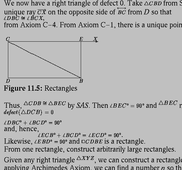
- LaTeX2HTML, math --> GIFs (e.g.The Defect of a Triangle)
(Note in particular the failure to align GIFs with the text baseline)

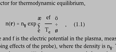
- TtH math --> symbol font + tables (e.g. Electric Probes in Magnetized and Flowing Plasmas)
(The page designer must have assumed I had some font installed.)

I don't know what products were used to create
http://www.rsasecurity.com/rsalabs/bulletins/twinkle.html and http://www1.shore.net/~ndm/java/mmexplorer/ax-ext.html but they suffer the same deficiency:


I recently found that StarOffice could be used as a browser; interestingly,
it gets this set of pages "right" (they are readable as intended, if not
exactly elegant).
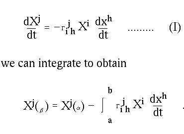
- Stef's HTML Equation Generator, math --> GIFs + symbol font (e.g. The Riemann Curvature Tensor)
(Symbol fonts are completely out of proportion. Use of ordinary font, not even
italicized, makes equations look terrible)

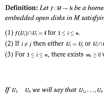
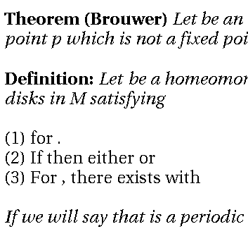
- WebEq math --> applet (e.g. Brouwer's Theorem)
(Not bad appearance: except for font-size disparities, the only problems are
a couple of missing symbols and slightly truncated images such as the \emptyset. This page takes rather a long time to load.)

(On another machine I have java turned off completely and, predictably,
the output is terrible:)

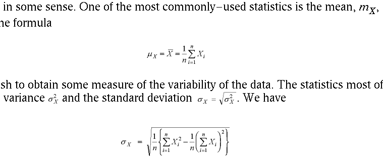
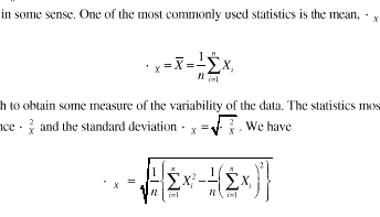
- MathType math --> Tex or MathML or GIFs (e.g. Mean, Variance, and Standard Deviation)
(Also not bad except for use of (in my case non-existent) symbol fonts. Also some font-size disparaties. Second illustration shows the same document in
PDF format. Note that a font is missing. Also note size of default font.)


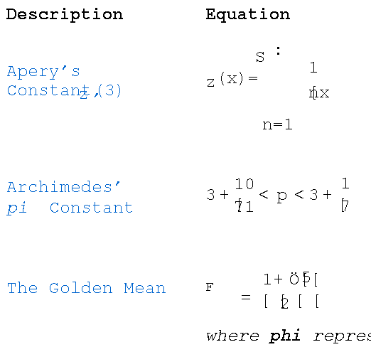
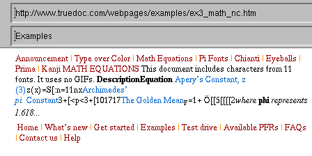
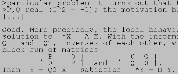
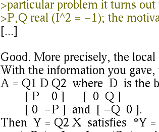
- TrueDoc uses javascript to load fonts on the fly; indeed you
can design your own fonts. Supposedly. Here's MATH EQUATIONS supposedly with 11 fonts
and no GIFs at all. Images show results in my Netscape, Amaya, and StarOffice
browsers.


- ASCII-art is limited and ungraceful, but often serviceable.
A sample from my own pages:

But when that same page is viewed through Deja.com, it's HTML-ized, and
so my browser uses a proportional-width font, making a mess (and the
mess would be worse if the re-transmitter chose not to respect line-breaks
at all!)

So what does work? Well, there are a few options you might want to consider,
but each has pros and cons like the examples above.
- Writing TeX source directly into the human-readable display (e.g.
writing out "a_n" and "\alpha") is comprehensible to
mathematicians but not to most novices. Likewise one can communicate in a
quasi-computer-language fashion. These are the kinds of methods prefered
for email communication; details.
- It is possible to create a page of mathematics by any other
means, then scan in (or use screen capture) whole pages as .GIF or .JPEG
images. (The former is probably better for text.) Viewers for these image
formats are included in most browsers. Unfortunately these tend to be
large files, are not searchable documents, and cannot be modified by the
page author without recreating the entire document.
- HTML now has a few "official" standard versions as well as proprietary
"improvements" incorporated by some browser producers (but not necessarily
supported by other vendors. Check out the Best Viewed With Any Browser campaign.) HTML mathematics primitives e.g. for subscripts and math-italics
En(f)
are clumsy and rendered improperly by text-only browsers such as Lynx.
The base alphabet for HTML is supposed to be ISO8859 or UNICODE (depending
on which HTML standard version you wish to consider) which allows for the
direct embedding of various accented characters, but of course these may
or may not be supported by your browser: e.g. an "o" with an umlaut over it
should be representable by either an HTML-recognized ASCII string or a single
ISO character; do these both work for you? (ö and �� ) With the full
16-bit character set, nearly all mathematical symbols would be directly
available in HTML (but not the spacing and two-dimensional layout which
can be fine-tuned in TeX, say). For information on proposed standards for
math symbols, try AMS or
unicode.
The next generation(s) of HTML are under development; presumably
future browsers will accomodate MathML documents; see
http://www.w3.org/TR/REC-MathML/.
These developments are thankfully being guided by parties such as the
American Mathematical Society.
Expect to see a healthy market in enhanced browsers for the webpage reader
(see below) and editors for the webpage producer (e.g. MathType, above);
for MathML is designed to be very detailed and much too cumbersome for
humans to read and write directly. (examples)
- If the person on the viewing side can be assumed to have a plug-in,
one can use the web to distribute files of various filetypes, including
several popular types of files which render mathematics essentially
perfectly:
DVI,
PostScript,
PDF,
Mathematica,
and even
Microsoft Word
files can be read this way.
IBM's Techexplorer is a plugin which can read TeX and MathML directly.
Mnemonic is a new stand-alone browser designed to support the newer standards for HTML, and XML (and some TeX). Other browsers are likely to support
some of these formats in time (I believe Amaya can already).
Besides the installation of the plug-in (a one-time chore),
these formats require transmitting rather large files -- often for no
particular purpose, since simple text is sufficient for many messages.
Also note that not all these formats can render complicated mathematics,
included graphics, and hypertext links with equal ease for the page designer
and the person viewing them. I don't know if they are all supported by
printer software, either.
Sadly, I don't have a final recommendation. My own choice is
- For informal material, I just use flat text with ASCII-art and TeX-like
syntax used as appropriate
- For simple formal documents I use HTML with minimal markup (e.g. math symbols
in italics). I prefer single, small, searchable, scalable documents whose
appearance is a little poor, rather than large binaries, multiple inline GIFS, whole
page images, assumed symbol fonts, and assumed browser.
- For complex formal documents I will go whole hog to PDF. My main concerns
here (time to launch the viewer and size of transmitted file) are gradually
being addressed by protocol and hardware improvements.
- For complex sets of documents, I would recommend an off-line master
copy of files in some universal format (TeX is probably OK), from which
ASCII, HTML, PDF, and maybe DVI files can be generated and offered as
user options.
This web page is merely an attempt to highlight some of the ongoing
trends. For further information, consult:
- Math Typesetting for the Internet (Math Forum, Swarthmore)
- Some other pages with many links:
tex4ht,
acrotex,
tth,
rsc,
Gellmu,
Calculus@Internet
Websurfing tips
- the newsgroups comp.text.tex, comp.text.sgml, comp.text.xml,
comp.infosystems.www.authoring.html. There are mailing lists for
MathML (www-math@w3.org), WebMath
(http://www.camel.math.ca/cgi-bin/wcms/webmath.pl) and electronic math
journals (emj@cnsibm.albany.edu).
- You might want to contemplate the methods used at some sites to distribute
mathematics articles in a variety of formats, the reformatting (apparently) done on the fly! Visit the Zentralblatt, Math Reviews,
ArXiv preprint server, or
JFM sites.
Last modified 2000/02/23 by Dave Rusin, rusin@math.niu.edu.
